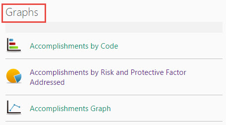
Graphs
A key challenge in evaluating comprehensive community health initiatives is how to document and illustrate the unfolding of the intervention; that is, the multiple changes in the environment that can lead to widespread behavior change and improvement in population-level outcomes.
Using online graphs, community and research partners can examine the rate of community/system changes over time, or allow for systematic reflection on the proportion of changes occurring in different sectors.
To begin, locate the
Graphs web part on your CCB.
(Contact your Site Owner if you are unable to locate the web part.)
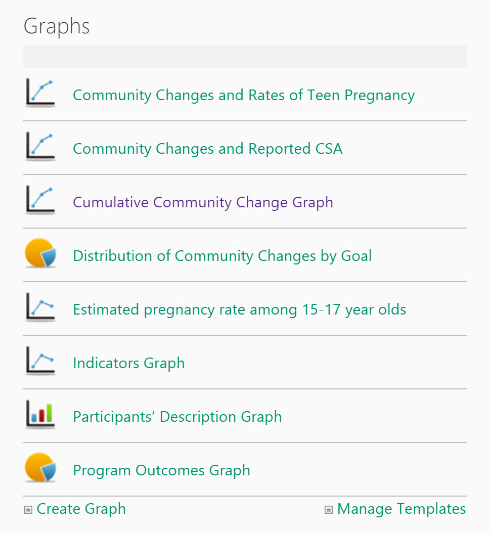
As graphs are added to the site, they will appear in a list within the web part. The graphs will feature an icon representing the graph type, along with the assigned title. Click on an individual graph to view it in greater detail or edit it.
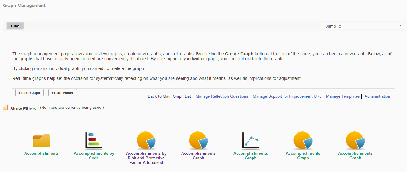
Only a certain number of graphs will be included on the list in the web part. To view all graphs, click on the
Graphs web part heading. This will open the Graph Management page, and display all graphs.
Here is an overview of some of the options you will encounter when you create a graph.
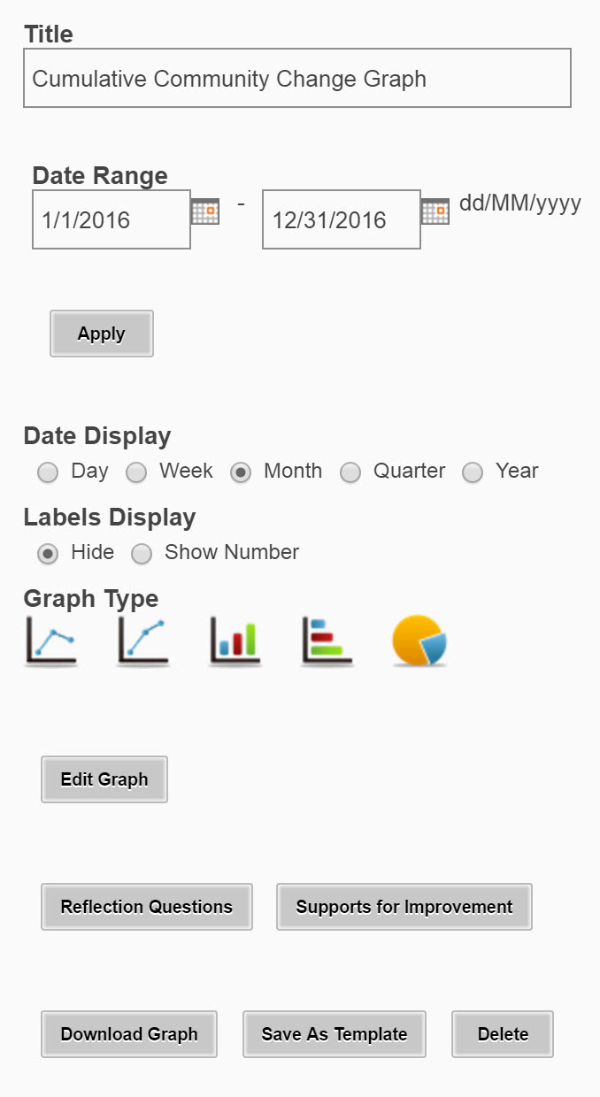
- Graph Name: Assign a descriptive name to your graph, e.g. "Services Provided May 2018." Each graph name must be unique.
- Note: No special characters (other than a dash or underscore) can be used in graph names.
- Date Range: Adjust the range of data displayed by changing the dates shown. You can type the dates in or use the calendar that appears when you click within the box.
- Date Display: For a broader or narrower view of the data points throughout the designated date range, you can change the Date Display to reflect data points by Day, Month, Quarter or Year.
- Labels Display: Display or hide data labels on the graph to help identify the values shown in each data point of the data series. If using a pie graph, the option will exist to Show Percentage.
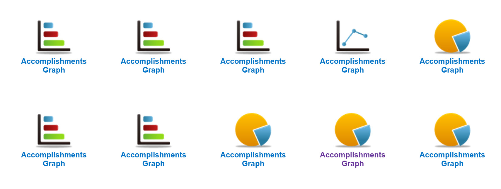
- Graph Type: If you would like to view varying presentations of the data, you can modify the graph type by selecting from the Graph Type icons.

| Line Graph: Line graphs are used to track changes over periods of time or cumulative changes. |

| Pie Chart: Pie charts are best to use when you are trying to compare parts of a whole or show a distribution of categories. |

| Bar Graph: Bar graphs are used to compare data between different groups or to track changes over time. When trying to measure change over time, bar graphs are best when the changes are larger. |

Supports for Improvement
Supports for Improvement provide helpful guidance and links for solving problems and dilemmas documenters may be encountering in their work.
Reflection Questions
Reflection questions are tailored questions that encourage documenters to think carefully about, better understand, and communicate the meaning of their data. Please talk with your site owner or KU Work Group staff if you need
Download Image
Click Download Image to print or save a copy of the graph for use in presentations or other tools offline.
Save as Template
Click Save as Template to make the graph available when graphing similar data in the future.
Delete
If you do not need to retain your graph for future reference, click Delete to remove it from the system.
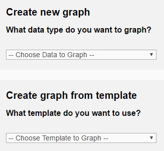
You can create a graph by clicking the
Create Graph button at the top of the Graph Management page, the link at the bottom of the webpart, or if your site uses buttons, the Create Graph button on your main CCB page.

-
Click
Create Graph.
-
Select from the
Create a new graph
dropdown menu if you want to create a new graph, or
-
Select from the
Create graph from existing template if you want to use a previously created template.
-
Click
Create Graph.
Note: The date range is predetermined by site and will automatically display based on the settings. To adjust the default settings, please contact your site administrator.
- Assign a descriptive title to your graph.
-
Adjust the Date Range by changing the dates shown. You can type the dates in, or use the calendar that appears when you click within the box
-
Adjust the date display if needed.
- Adjust the Labels display if needed. If using a pie graph, a Show Percentage option will also be displayed.
- Adjust the graph type if needed.
- Click Apply to save these changes.
- Click on Edit Graph to select options for the data you want to graph.
When you click the
Edit Graph button, this will open a new window with options to
Edit Basic Information,
Edit Data,
Add Additional Data,
Add Additional Sites, and
Add Comparison Graph. Simply rollover the category you want to edit, and then type in the new information.
Edit Basic Information
Title
Update the title of the graph.
Note: The default title will always be the name of the data selected for the graph (e.g., Accomplishments, Participant Data).
Date Range
Adjust the range of data displayed by changing the dates shown.
Date Display
To review a broader or narrower view of the data points throughout the designated date range, you can change the
Date Display to reflect data points by Day, Month, Quarter or Year.
X and Y Axis Label
Update the label for the
X Axis and
Y Axis as needed.
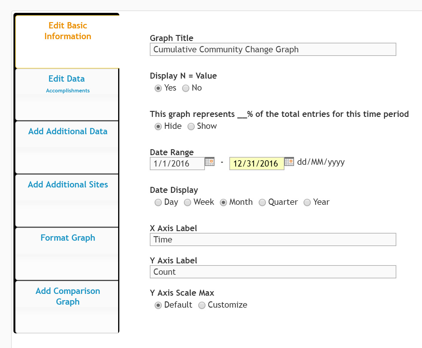
Labels Display
Click here to either display the data labels on the graph, or keep them hidden.
Graph Type:
If you would like to view varying presentations of the data, you can modify the graph type by selecting from the
Graph Type icons.
Legend
This field allows you to modify the legend of the graph. The default for the legend will automatically be the name of the data selected for the graph (e.g., Accomplishments, Indicators, etc.).
Note: Legend field names cannot be more than 30 characters. No special characters (other than a dash or underscore) can be used in legend names.
Data Source
This is the source of your data (e.g., Accomplishments, Indicators, etc.)
Observer
Observer 1: Primary Data
Observer 2: Reliability Scorer Data
Observer 3: Calibration Scorer Data
What specific information do you want to graph?
This field is where your data is coming from, i.e., what you are graphing.
Note: By selecting Update Graph your changes will be saved and you will stay on this page. If you select Save & Go to Graph you will be returned to the graph display.
Please note that you are able to select multiple sites (e.g., different programs or locations) and series (e.g., different data sets) from which to graph. In order to add data to your graph, simply click on
Add Additional Data or to add sites, click on
Add Sites.
Add Additional Data
Select from the data sources on your site to include additional data in your graph.
Add Additional Sites
Select additional sites from within the site collection of your WorkStation to layer data in your graph.
Add Comparison Graph
You also have the option to add a comparison graph. For instance, if you want to compare Accomplishments from this year to the previous year, you can choose last year's graph from the
Select Comparison Graph drop-down menu and hit
Save. This will return you to the graph display, and you will see the graph that you just created on the left side, and the comparison graph that you just added on the right.
Once you have added a comparison graph, you can also edit this graph, by selecting
Edit Comparison Graph. If you decide you no longer want the comparison graph, you can simply click the
Edit Graph button again, and under
Add Comparison Graph, you can choose
No graph under the
Select Comparison Graph drop down menu.
Once a comparison graph is selected, you will be able to view the two graphs stacked within the window that appears.
During the graph creation process, you may find that you periodically create graphs with the same set of criteria. To help save time during this process, you can create a template from a graph.
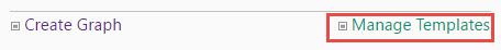
To begin, select
Manage Templates from the web part menu.
This will take you to the Graph Management for templates. On this page, the Create Template button will allow you to create your new template. This page will also show all existing templates that you can choose from to create a new graph.
Once you have created a template, the next time you create a graph, when prompted
Create a new graph, or Create graph from template, you can select the template created from the drop-down menu.
To view all the graphs that have been created on the site, click the
Graphs heading on the web part.
This window will display all available graphs on the site.
You can view additional details about each graph by placing your cursor over the specific graph. You will be able to view the Date Range used when creating the graph, the date the graph was created, and who created the graph. If the graph has been modified, it will display the details from the most recent modification, rather than the initial creation.